Color
Overview
Section titled “Overview”Home and the environment in which they exist inspired Kin’s color palette. Kin Yellow is our core color. Neutrals are included as base colors and accent colors provide boldness and functionality to surfaces.
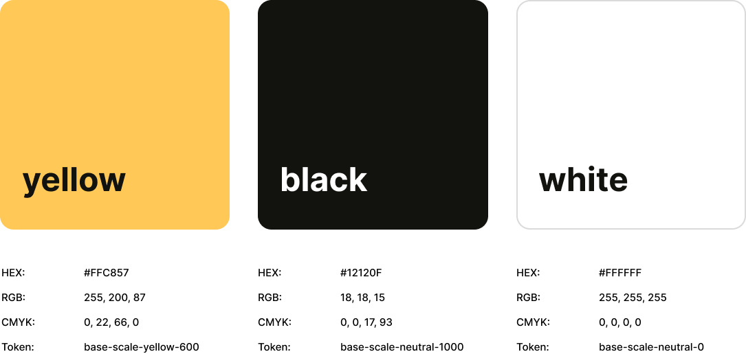
Core Colors
Section titled “Core Colors”Our core colors reflect the essence of Kin’s history, highlighting the brand’s signature yellow. This yellow is paired with both ends of our neutral palette to enhance its impact when they are combined. It can be utilized as an accent, drawing attention to important elements in our designs. Our palette includes neutrals that elevate our overall look and provide a canvas for our designs.
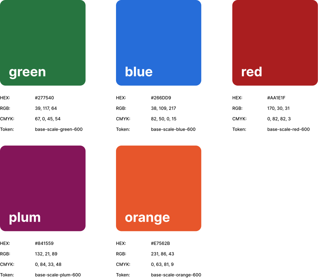
Secondary Colors
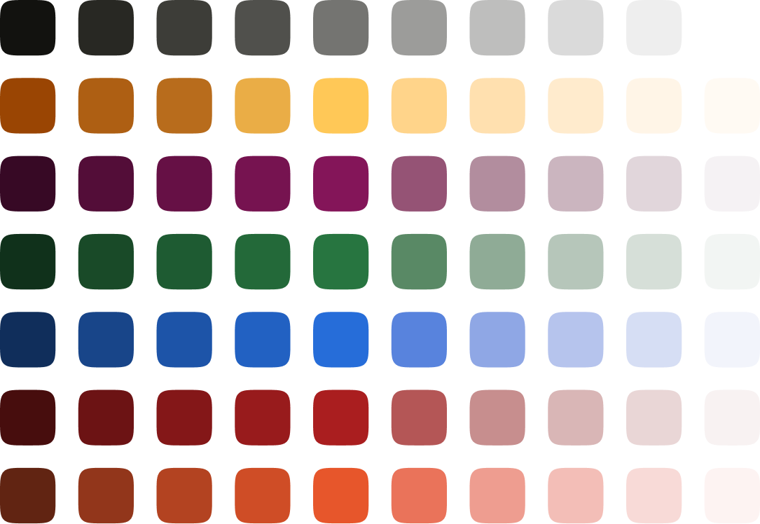
Section titled “Secondary Colors”Our secondary palette was designed to complement Kin yellow. Our extended palette consists of 7 brand colors, expanded to 70 shades. This extended palette serves a functional purpose by enhancing comprehension and providing additional clarity through visual hierarchy.
Color Scales
Section titled “Color Scales”Color scales were developed based on a value of 600 for our colors and divided into 10 distinct shades. This results in a total of 70 colors available for use, including neutrals. These additional shades can be utilized to create tonal color combinations, represent different product states, and develop custom palettes for both light and dark modes, among other applications.
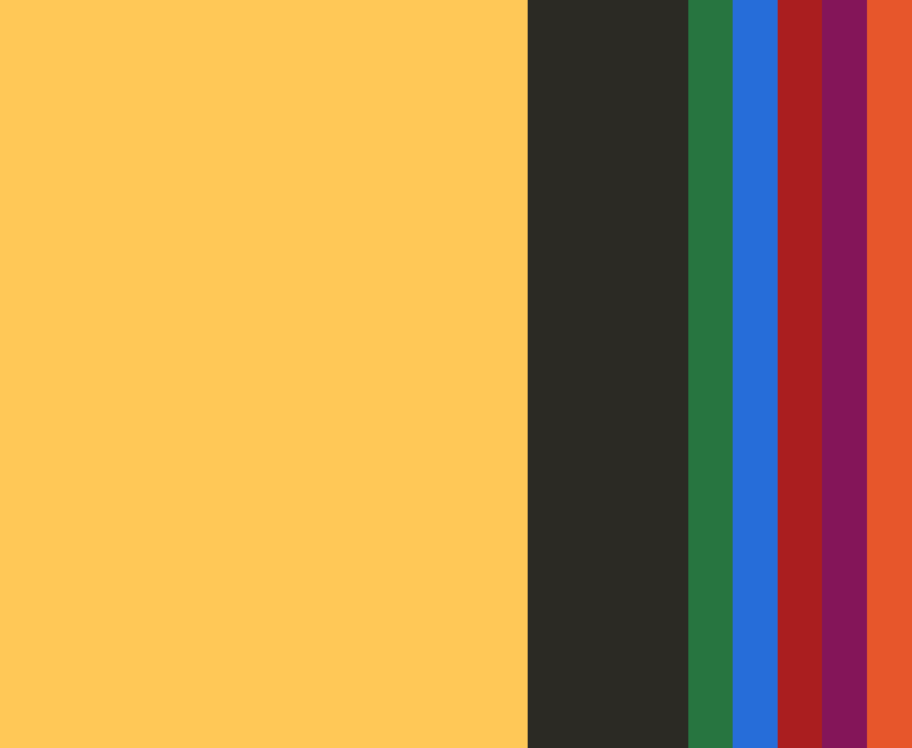
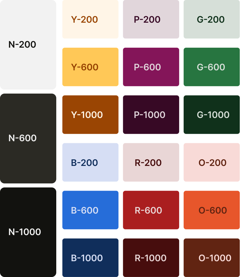
Tonal Color Pairing
Section titled “Tonal Color Pairing”The tonal themes are designed for applications where we can showcase our brand more flexibly, particularly on social media platforms where users have greater context about our brand. This approach helps reduce visual fatigue across everyday channels and provides us with the flexibility needed when creating campaigns.
We use color values of 200, 600, and 1000 for our themes. It’s essential to pair the right colors to ensure we meet accessibility requirements.
Best Practices
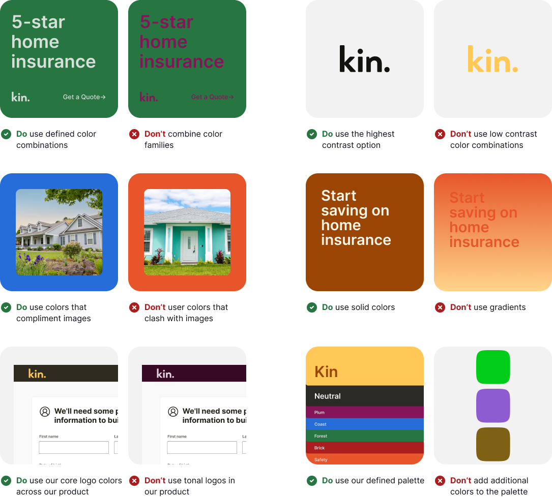
Section titled “Best Practices”Using best practices with color will ensure our brand remains consistent and recognizable across all surfaces.